Visualising PV output with 3D Surface Plots
In order to experiment with the 3D plotting functionality of R, I used nearly a year’s worth of power output data from my solar panel installation at home.
The photovoltaic data
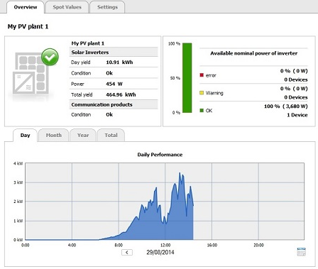
At home I have a 6-panel photovoltaic (PV) system that can generate a peak power of 290W per panel, i.e., a system total of 1.74 kWp (kilowatt peak). The inverter that comes with this system has a network connectivity card that allows for remote monitoring of the system from the internal network using a specific application called SunnyExplorer. The inverter’s network card has also the capability of uploading daily power production data and diagnostic information automatically to a cloud-based service www.sunnyportal.com.

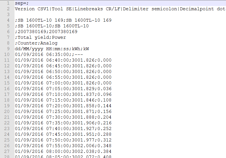
For experimenting with R’s 3D plotting functionality, I am using daily power production files downloaded from the system’s inverter. These files are CSV with instantaneous power output sampled every 5 minutes throughout the daylight portion of the day.
The data contained in the file is very straightforward: it consists of a timestamp, the kWh cumulative total power yield, and the kW output being generated at that moment in time (probably smoothed by the inverter’s electronics/software logic over the current 5-minute sampling window).

Loading the data in R
Since we have a number of daily files, and because due to a change in system configuration, not all files have the same naming convention, we will use the following code to load the PV data.
This code goes through all ther files found that have the given filename patterns and loads each of them one by one, adding the data to df.
# create an empty data frame
df <- data.frame()

# load all the separate files and append them to the data frame df
files <- dir(pattern='My PV plant 1\\-2016[0-9][0-9][0-9][0-9]\\.csv')
files <- c(files, dir(pattern='RKsPVsys\\-2016[0-9][0-9][0-9][0-9]\\.csv'))
for (file in files)
{
     cat('reading', file, '\n')
     df0 <- read.csv(file, header = T, skip = 8, sep=';', stringsAsFactors = F, fileEncoding='UCS-2')
     df <- rbind(df, df0)
}
One thing to note is that the CSV files are not in UTF format, but are encoded in UCS-2 format.
Hence the need for the fileEncoding parameter in read.csv().
Data cleaning
Some data cleaning is necessary to ensure that the datetime columns are actual Date-Time objects (and not string). Same for the numeric fields.
We also remove rows that have missing data (NA’s).
# convert the timestamp column to datetime
df[,1] <- as.POSIXct(df[,1], format='%d/%m/%Y %H:%M:%S', tz='UTC')
colnames(df)[1] <- 'Timestamp'

# convert the kW and kWh columns to numeric
df[,3] <- as.numeric(df[,3])
df[,2] <- as.numeric(df[,2])


# remove any entries that have NULL values
df <- df[complete.cases(df),]
After the data cleaning process, we end up with a dataset with 87,967 measurements covering 10 months of data (January to October 2016).
3D Plotting
When it comes to plotting a 3D surface plot of the loaded data, we encounter a snag!
Currently, when plotting any 3D surface maps, R does not allow the use of dates and timestamps for the horizontal dimensions (X and Y).
Thus we need to modify the data, first, to ensure that the dates and timestamps are sampled at regular intervals with no missing date/time ranges. Secondly, we must replace (or cast) the original date and time values with more friendly numeric values.
The following code does this:
date.range <- range(as.Date(df[,1]))               # get the date range (year-month-day) for the loaded PV data

d <- as.POSIXct(date.range[1], tz='UTC')
d2 <- as.POSIXct(date.range[2]+1, tz='UTC')
attr(d, 'tzone') <- 'UTC'                     # the timezone gets lost in the call of the as.POSIXct.Date, so we have to explicitly set the timezone again here
attr(d2, 'tzone') <- 'UTC'                    # the timezone gets lost in the call of the as.POSIXct.Date, so we have to explicitly set the timezone again here

# ensure that in df we have regular entries every 5 minutes for all days for which we have PV data
while(d < d2)
{
     if (max(df[,1] == d) == 0)
     {
          df0 <- data.frame(Timestamp=d, kWh=0, kW=0)
          df <- rbind(df, df0)
     }
     d <- d + 5*60          # the PV data is sampled every 5 minutes
}

df <- df[order(df$Timestamp),]


# split the timestamp column into separate Dates and Times columns
df[,4] <- as.Date(df[,1])
df[,5] <- as.numeric(difftime(df[,1], as.Date(df[,1]), units = "days"))
colnames(df)[4] <- 'Dates'
colnames(df)[5] <- 'Times'

library(lubridate)
df$Month <- month(df$Dates)
df$Year <- year(df$Dates)


# clear duplicate entries (caused by duplicate files)
df[duplicated(df),] <- NA
# then remove the rows (marked with an NA)
df <- df[complete.cases(df),]


# prepare for 3D surface plotting, taking into consideration that currently R does not allow 3D plots to use raw Datetimes as X and Y coords.
new.dates <- with(df, sort(unique(Dates)))
new.times <- with(df, sort(unique(Times))) * 10
new.values <- with(df, matrix(kW, nrow = length(new.dates), ncol = length(new.times), byrow = TRUE))

require(rgl)

zlen <- length(table(new.values)) + 1
colorlut <-topo.colors(zlen) # height color lookup table
zmax <- max(new.values)
col <- colorlut[round(new.values/zmax*128) +1]      # assign colors to heights for each point

surface3d(new.dates, new.times*2, new.values*2, color=col)
In the above code, we ensure that sampling is done every 5 minutes throughout the whole day; in case of a missing entry at a sampling interval, we add a new row with production values set to 0.
We also split the timestamp into separate columns for the day and the time to aid later computation.
After that, the function surface3d from the rgl package, is used to display power output.
Some Results
The following graphs show the 3D surface plots obtained using R for the months January 2016 to Octoboer 2016.


And the image below shows a full 3D plot over the approx 10-months worth of data (click on the image to see a larger version):
Some visual observations that can be drawn from these 3D surface plots are the following:
-
Note the effect of winter weather (especially cloud coverage) on power production. For the months of July and August one can see that the plot is nearly solid with little variation due to the lack of clouds in the sky. There are some well-defined gaps in the data - these are due to power interruptions due to some ongoing electrical works that I carried out in the house during these months.
-
Also visually evident is the longer hours of sunshine during the summer months compared to the winter months. This can be seen from the wider base of the surface plot.
Further Analysis
Much analysis can be applied to this dataset. One experiment I wish to run is to find correlations between the PV data and weather data. Data from historical weather data services, like weatherspark.com, could be used for this experiment. Of particular interest is to search for correlation effects (as there probably is) between PV data and cloud coverage data like the ones shown below and reproduced from the weatherspark website.


It will also be interesting to see if, apart from the somewhat obvious cloud coverage correlation that I think exists, if there are any relationships with temperature (the efficiency of solar cells is known to be temperature-sensitive), with humidity, wind speed, and cloud ceiling height. All this historic weather data appears to be available on the weatherspark.com site. This needs further in-depth investigation. Any future analysis (and results) will be posted in this blog.
 Obviously while doing this analysis, one has to keep in mind that correlation does not necessarily imply causation. And we must be on the lookout against wrong conclusions based on
wrong direction causation, third cause fallacies, and coincidental causation.
Recently I came across a good book by Lee Baker on the correlation-causation topic. It is an easy-to-read book and an eye-opener on correlation and causation. Details about this book
can be found here.
Google’s Project Sunroof and other interesting bits
There is some interested work that combines computer vision with PV power yield prediction. For example this work employs a sky camera system with detection of types and movements of clouds in order to predict variation in power output. ARENA’s work is another such example.
Also of interest is Google’s Project Sunroof. This project is currently operating only in the US. But it’s a very interesting idea that fuses a number of datasets together in order to provide information on the optimal placement and orientation of PV panels on building roofs and the predicted/expected output. As mentioned on the project’s website, solar saving calculations make use of the roof size and shape (using the same 3D building structure acquisition technology as used in Google Maps), and compute shading zones based on 3D structure and the sun’s yearly pattern across the sky. In addition, local weather data is used, together with data on local electricity prices, local solar panel costs, and estimated incentives, in order to arrive at a final savings estimate.
 (Source: Wired.com)
More info can be found here.


